The Ultimate Guide to Prioritization
CHAPTER 1
Why Prioritization Will Make or Break Your Product
“People think focus means saying yes to the thing you’ve got to focus on. But that’s not what it means at all. It means saying no to the hundred other good ideas.” — Steve Jobs, Apple
Product prioritization is what keeps most of our product management community up at night.
Ultimately, our aim is to build successful products that solve our user’s problems.
All while trying to answer three seemingly simple questions: What to build, when and why.
But make no mistake, prioritization is much more than coming up with a list of features or initiatives and assigning it to a roadmap.
It’s a constant process of finding the right combination of features and initiatives to allocate your limited resources to solve a significant problem, aiming to turn revenue.
That’s why embarking on this journey will involve saying “NO” to an avalanche of great ideas, and defending your decisions from agendas, and opinions.
Sourcing the right insights will play a key role, and leveraging them alongside a quantitative or qualitative prioritization framework will allow you to make data-informed decisions. Prioritization without data is a collection of opinions.
A good prioritization framework and decision making process sets a clear route towards your goals, allowing your team to create an effective roadmap that leads to market fit, while aligning with your company goals.
Prioritization process vs gut-feeling decisions
One thing is for sure: making decisions based on gut feeling and subjective preferences (or misinterpreted KPIs) from other managers will definitely not help you build a product that delights your users, nor will it overfill your company’s bank account.
A prioritization process isn’t complete unless you have covered these four pillars.
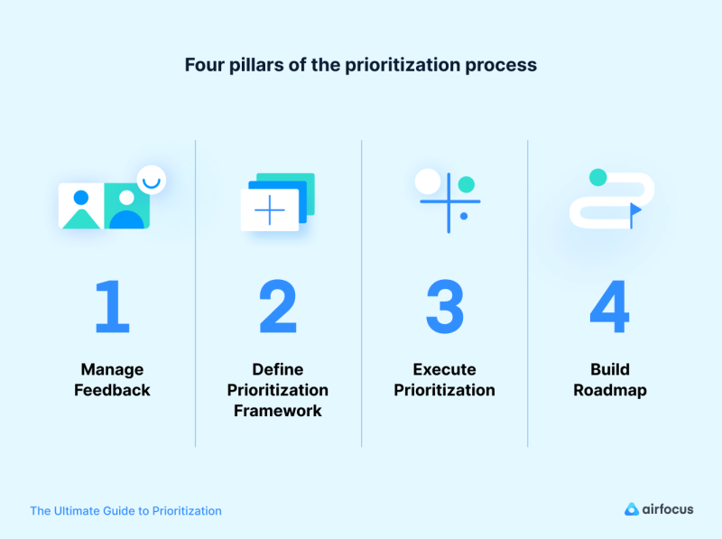
There is a clear pattern among successful products.
They have a strong foundation based on a defined prioritization process that always includes and iterates on four pillars. Therefore, we will cover why managing insights, defining a strategy for how to prioritize based on the product, executing prioritization and roadmapping our decisions are essential.
Download now: Get our 5-minute guide on How To Select the Right Prioritization Framework for Your Product
There is a clear pattern to be followed in order to build a powerful prioritization process. It always includes and iterates on four pillars that we will cover extensively.
These are: Managing insights, defining a prioritization strategy, executing Prioritization (what to build) and Roadmapping (when to build it).
After reading this book, you’ll have gained a full understanding and you’ll be able to build products your users actually want and are willing to pay for.
CHAPTER 2
Why Insights Are Essential and How to Source Them
49% of product managers claim that setting roadmap priorities based on market feedback is their biggest challenge, according to surveys. (Source: Mind the Product)
Reliable product prioritization and decision-making should start with feedback and market insights.
Surprisingly, product managers struggle heavily with making decisions based on market feedback.
Reality check:
How much time, money and energy have you foregone building features without a validated market-fit?
Sourcing useful and quantifiable insights can be very time-consuming. Often this makes gathering reliable feedback from stakeholders seem like a never-ending struggle.
Why is it so hard collecting feedback and generating insights?
Managers outside of your product team often worry about their ideas making it to the top of the list.
Download now: Get our 5-minute guide on Why Insights Are Essential and How to Source Them
This is sometimes exacerbated by bad KPIs, leading to poorly justified reasons as to why their suggestions are requirements.
Engaging your users for feedback is also tough due to the constant information overload — remember: they’re being constantly bombarded by different businesses and services.
This limits their willingness to provide useful feedback about their preferences and pain points again and again, as requested by nearly every company as soon as they hand over their contact details. Email and in-app message overkill have worsened this situation.
It’s easy to get caught in the rip-tide of biased samples and misinformation while trying to collect and interpret the right data.
Even your analytics tools (like Google Analytics or Amplitude) which provide a myriad of data can often present information gaps, making it a hotbed for misinterpretation.
So why should you jump through the hoops?
Quantifiable information helps to validate ideas. It reduces risk and is absolutely crucial to make data-informed and objective decisions.
Not investing enough resources in feedback and market intelligence, and doing a bad job at screening the needs of your users (as is the case with most companies), leaves you at the mercy of better products by companies who have a good understanding of their users.
Putting a system into place to help you
Managing your channels of feedback can be easy if you do it correctly. Putting a centralized idea management system in place will enable your team to have a reliable source of ideas and proof-points by collecting them in one place to review and analyze. And the right prioritization framework will help you decide if an idea is roadmap-worthy.
Sources of feedback and insights: turning problems into opportunities
We identified and reviewed 6 key channels that provide invaluable market insights and enable you to make data-informed and objective prioritization decisions:
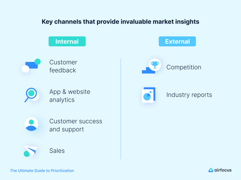
Not all channels are created the same. Therefore, understanding how to extract and manage the information yielded by each one of them is crucial.
Customer feedback — direct insights
Your users are a great source of inspiration for product improvements, so they're a good place to start gathering data.
These are our suggestions:
Website polls: if you have a high-traffic website, you can use polls to get direct insights into your client's needs.
Email list surveys: These are great when you have an established customer base.
Direct user tests and interviews
Social network comments and surveys
Google Marketing Platform’s consumer surveys: Cost-efficient (~ € 0.10 /Response), an efficient way to get feedback from your target audience with faster turnaround than traditional market research.
Third party market research companies: when you're looking for a representative sample
Start gathering these insights as soon as possible
App and website analytics
The voice of your current users is indispensable when it comes to understanding if your product meets — or will meet — your target user needs; but so is their behavior. Where voice represents opinion, behavior (in many instances) represents facts.
Having access to real-time behavioral user data on your product or similar ones in the market provides you with insights on which ideas are of value.
Sales: a double-edged sword
Your sales team is constantly in touch with your users. This makes them a great resource for user feedback. They are in constant contact with the user, listening to their needs, often spotting trends about requested features, as well as hearing their pain points.
Keep in mind that sales is typically the loudest voice in the room, highly affected by short-term gains as well as motivated to close deals with large accounts. Listen to their feedback, but make sure any feature requests will provide value to the majority of customers.+
Customer success and support
Just like sales, your customer support team is always in touch with your users, but they have something sales doesn’t: exact insight into what’s troubling your current user.
User issues can be easily grouped into categories and measured in order to decide on what to improve. Your categories should start with broad areas such as functionality or performance and then narrow down to specific focus points.
As with feedback from sales (or indeed any other type of feedback), it should be backlogged, quantified, and analyzed.
External Sources
Industry reports
Industry reports, research, and analyses by advisory firms such as Gartner or Nielsen provide great insights into your industry and help gain insights into what products work, which don’t and for which target customers.
The downsides of obtaining this data are often the lack of flexibility and the high cost, depending on the report and service.
Competition
Let’s get one thing out of the way — looking at what competitors are doing doesn’t mean comparing your product to theirs, but sometimes it helps to look outside.
Your product should seek to have a unique and instantly identifiable selling proposition and prove its value.
With that said, you can source valuable intelligence from your competitors.
You should get acquainted with what users like about their products, what they don’t like, and features they wish were offered by them.
CHAPTER 3
How To Select the Right Prioritization Framework for Your Product
Long gone are the days of gut-feeling and messy prioritization spreadsheets.
The most impactful way of approaching the decision-making process is to have a defined framework in place.
This will enable prioritization to become a standardized process, and will yield the most impactful decisions for your product.
Putting a framework in place will empower your product team to filter out data points or requests that aren’t of significant value or are simply gut-based, leading to objective decision-making.
Let’s expand on these benefits:
A framework creates clarity to decide what to build next for your team by replacing subjective guesswork with highly informed product decisions based on smart scorings.
It will allow you to see the big picture and set the right priorities.
You’ll be able to focus on the right things by visualizing the importance of each initiative and feature. Ultimately this will help you to make high-impact product prioritization and tradeoff decisions.
In turn, this will create confidence in the decisions the team is making and will foster a data-driven process, rather than one that’s plagued by emotional, time-consuming meetings that become hard to track.
There's no wrong prioritization framework. But there are wrong applications.
The following parameters will determine which framework should work best for you:
The strategic level of items you are considering.
The lifecycle stage and complexity of your product.
The size of your team and company.
The company culture and organizational structure, for example, if you have remote teams.
Keep those aspects in mind when picking a framework for your team or organization.
Managing prioritization from your vision to your features
“If the team doesn’t agree on the big picture, then they certainly won’t agree on a single feature.” Richard Banfield, author of “Product Leadership: How Top Product Managers Launch Awesome Products and Build Successful Teams”
Following the quote, prioritization needs to be done from the highest to the lowest level of product management.
Product vision and strategy
It all starts with the product vision and strategy, which establishes the overall direction of where you’re going and what the product aims to accomplish.
The product strategy will define the main audience, which of their needs you plan to satisfy and which pain points to relieve.
This is the point where you or the people above you start by saying “no” (...a lot). You’ll need to say “no” to all initiatives and features that simply do not help to reach your strategic goals.
Product initiatives
A very helpful method for keeping your team focused on what is truly important is to define high-level product initiatives. These should link the overarching strategy to lower-level product features.
Setting your initiatives starts with breaking down your strategy into the high-level efforts needed to reach your strategic goals.
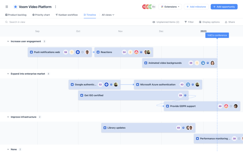
Let's use the following example from the fictional VOOM Video App to demonstrate what this breakdown might look like in practice. It’s part of VOOM’s strategy to make their platform enterprise-ready within the next 12 months. So they start the initiative “Enterprise readiness”. The following epics and features are part of this initiative:
Single sign-on (SSO)
Reporting
User roles and permissions
Qualitative or quantitative prioritization?
A prioritization framework, be qualitative or quantitative, will provide a set of guidelines to create products that deliver value to both the customer and the business, while allocating your limited resources most efficiently.
For very high-level prioritization, in most cases a qualitative approach makes sense. This can be a qualitative framework such as story mapping or —as simple as it sounds — in some cases brainstorming or discussions, and some idea sparring.
Download now: Get our 5-minute guide on How To Use the Story Mapping Method
When the high-level decisions have been made and the strategy is set, it often makes sense to go with a quantitative approach using a prioritization framework to prioritize features and initiatives.
Ultimately it should be a scalable, repeatable and standardized process to resolve what features to work on next and in what sequence, while answering questions like:
Does it align with our company vision, strategy and goals?
How do we get the overall maximum value out of our limited resources?
Are we correctly addressing user needs and delivering value?
Will it yield the highest business value?
How can we generate enough buy-in to get to market, and to get teams & stakeholders onboard?
What features will we prioritize for the next release?
So how do you know which prioritization framework is the best fit for your product and company?
To make it easy for you to find the right framework for your specific needs, we’ve curated a list of the seven best methods, used by thousands of product professionals (see next chapter).
Each method is broken down into useful modules that enable you to understand when to use them, with best practices and examples.
Taking prioritization frameworks with a grain of salt
We say this because, although prioritization frameworks shed objective light on the features and initiatives you’d like to measure, they are blind to all external criteria that are not considered within the framework. This includes things such as dependencies, the dynamics of the competitive landscape and budget cuts or limitations, to list just a few examples.
Important
Prioritization frameworks are completely blind to all criteria that are not considered within the framework.
These limitations should be taken into account when prioritizing and could be reasons to decide to break from the solutions your framework offers.
Though veering from the framework may sound unintuitive, it is still essential in providing the opportunity-cost of making such a decision.
CHAPTER 4
The 7 Most Popular Prioritization Frameworks
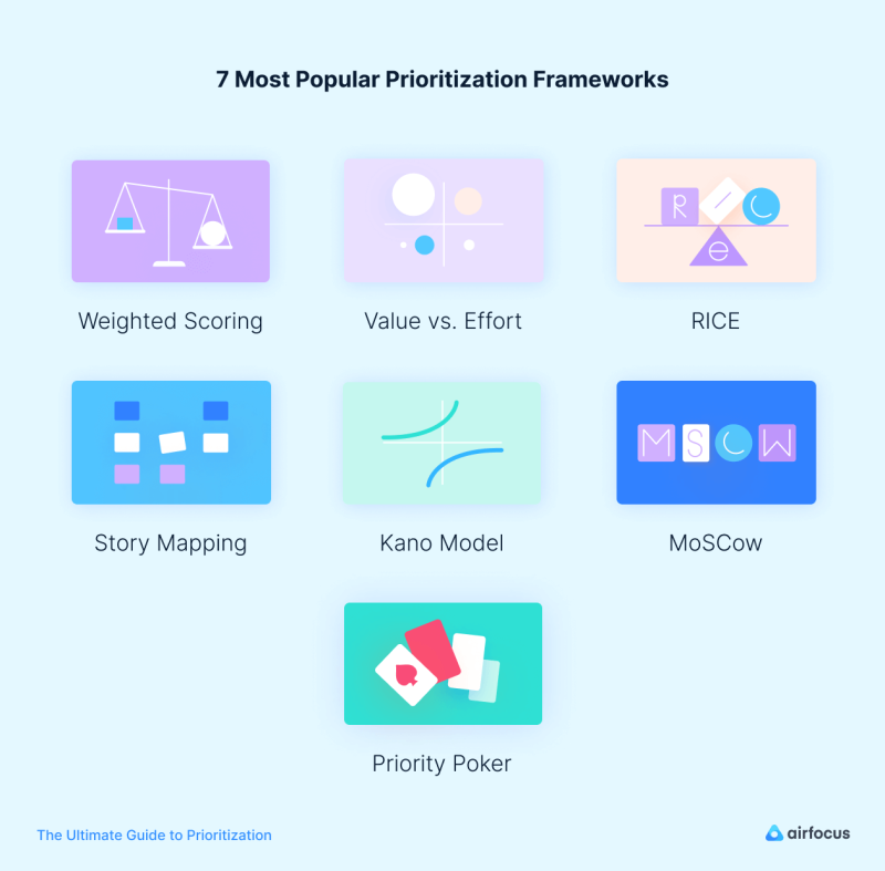
This chapter will navigate you through 7 of the most popular prioritization frameworks:
Weighted Scoring
What is weighted scoring?
The weighted scoring decision matrix is a powerful quantitative technique. It evaluates a set of choices (such as ideas or projects, for example) against a set of criteria you need to take into account (strategic fit, revenue increase, risks, costs, hours/days required)
It also is known as a “weighted decision matrix model”.
Important:
This is often referred to as a "prioritization matrix", which is an umbrella term that’s also used to describe the Value vs Effort model. This crossover can often be a source of confusion. But don’t worry, we’ll be sure to be very clear about what we are talking about.
There are two main types of decision matrix: weighted and unweighted. The unweighted decision matrix assumes all criteria have the same importance while the weighted one applies different weights.
Weighted scoring and its decision matrix technique is not only widely applicable, but also one of the best ways to tackle important and complex decisions.
When should you use a weighted scoring decision matrix?
The weighted decision matrix is particularly useful, specifically when you have:
Many choices (such as different features, projects, and campaigns).
Multiple decision criteria to consider (such as strategic fit, costs, risk, and customer value) with similar or varying levels of importance.
It's exceptionally powerful when you have to choose between multiple promising options and need to consider many criteria, or when you need to allocate limited resources to multiple options.
By extensively evaluating your choices and quantifying the process, you'll be able to greatly reduce (and in many cases remove) emotion and guesswork from the decision process. This enables rational and objective decisions every time.
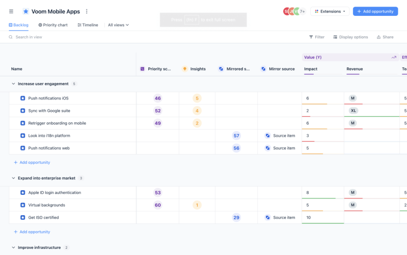
A dedicated prioritization tool like airfocus (shown below) allows you to set this up in minutes, but you can find how to recreate it with your own tools in our prioritization guide.
How to create a weighted scoring decision matrix?
1. List different choices
Start by listing all the decision choices as rows. Don't forget any relevant choices, since these rows will form the foundation of your decision matrix.
In another VOOM Video App example they are:
Google calendar integration
New onboarding
Slack bot
2. Determine influencing criteria
Brainstorm what criteria will affect those decisions (this could be things like strategic fit, revenue increase, costs, project hours, and risk of failure, for example). List these criteria as columns.
Tip:
Positive criteria usually represent your current product or business goals.
Using costs and or project hours (or something similar) is a good starting point for negative criteria.
Sometimes deciding whether to add criteria can be a bit of a trade-off
Having fewer criteria makes the prioritization process easier and less time-consuming.
Leaving criteria out makes your model completely blind to this type of impact.
3. Weigh your criteria
Weigh each of these criteria in the columns using a number (the weight) to assess their importance and impact on your decision. Establish a clear and consistent rating scale for each one (for example, 1, 2, 3, 4, 5 starting from an insignificant to greater impact). This helps to calculate the relative importance of each criteria.

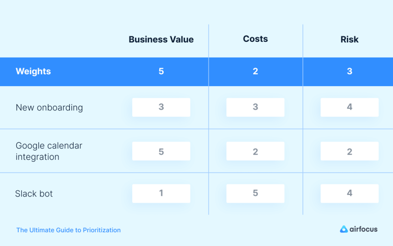
4. Rate each choice for each criteria
Evaluate your different choices against the criteria. While using your defined rating system (in our case, from 1 through 5), rate each criteria individually. For example, if you think your mobile app has tremendous business value, give it a 5. Keep in mind: the values for each choice don't need to be different. Equal weighting is perfectly acceptable.
For each of these values, you have to make sure that higher values represent more preferable options. For example, a high ROI should lead to a high Business Value score because a great ROI is beneficial to your business. On the flip side, high development costs should result in a low Costs Value because high costs are negative.
Tip:
Using a dedicated prioritization tool allows you to combine different value types like 1-5, any given amount of money (like $500 USD), or T-shirt sizes (S, M, L, XL) as well as scoring directions.
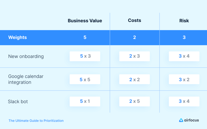
5. Calculate the weighted scores
Multiply each of the choice ratings by their corresponding weight.
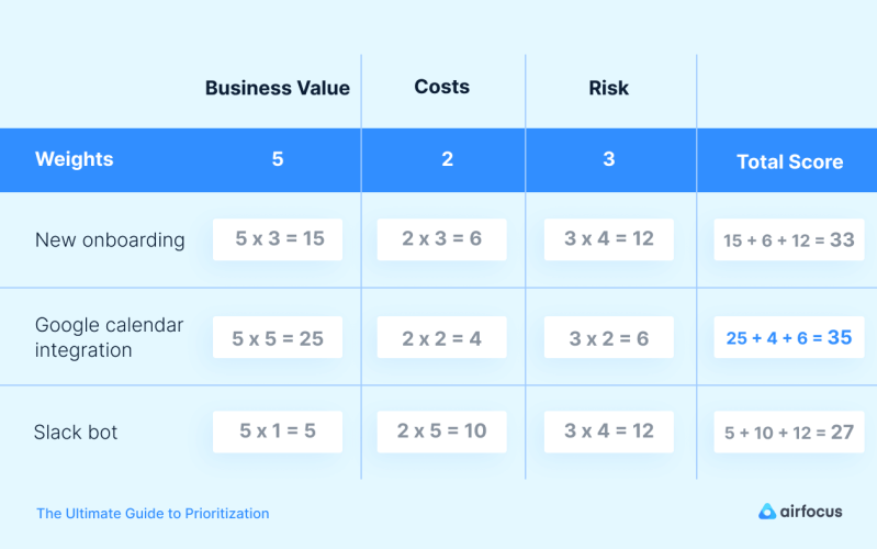
6. Calculate the total scores
Sum up each of the choices and compare the total scores.
3 pro tips before you get started
Now you know how to get started with a weighted decision matrix. Before you go ahead, check out these three essential tips to avoid common pitfalls:
1. Remove all unnecessary choices
Before you start creating your weighted decision matrix, identify what sort of criteria you think a winning choice requires. Does it need to meet a minimum amount of attributes? Does it need to align with a certain goal? By doing this, you will quickly eliminate unnecessary options. Removing all unnecessary items and criteria is a step towards simpler prioritization. Ultimately, this saves time and yields better results.
2. Rate each criteria separately
When it comes to considering each criteria, be sure to isolate it from all other criteria on the list. This will help you make an objective decision, putting this one criteria into perspective. You'll also be able to make a more unbiased score without being influenced by other factors.
3. Keep the decision matrix up to date
External realities (like a new competitor, for example), as well as internal goals and considerations (such as budget cuts), can change quickly. So, watch out for any new factors and update your decision matrix accordingly.
Why we love it
It creates transparency and agreement
about the importance of each prioritization factor in the decision-making process.
It’s one of the most comprehensive methods
of comparing numerous initiatives thanks to its linear layout.
It vastly reduces emotional bias
, as it is based on objective metrics that affect the viability of the feature in question.
A few downsides...
Could be subject to inherent bias:
criteria weight can be under or overestimated based on other criteria.
Blind to externalities
: doesn’t consider changing internal and external factors (new entrants).
Dependencies are not considered:
this can be problematic as dependencies are an important consideration when prioritizing.
Value vs. Effort
What is the Value Vs. Effort framework?
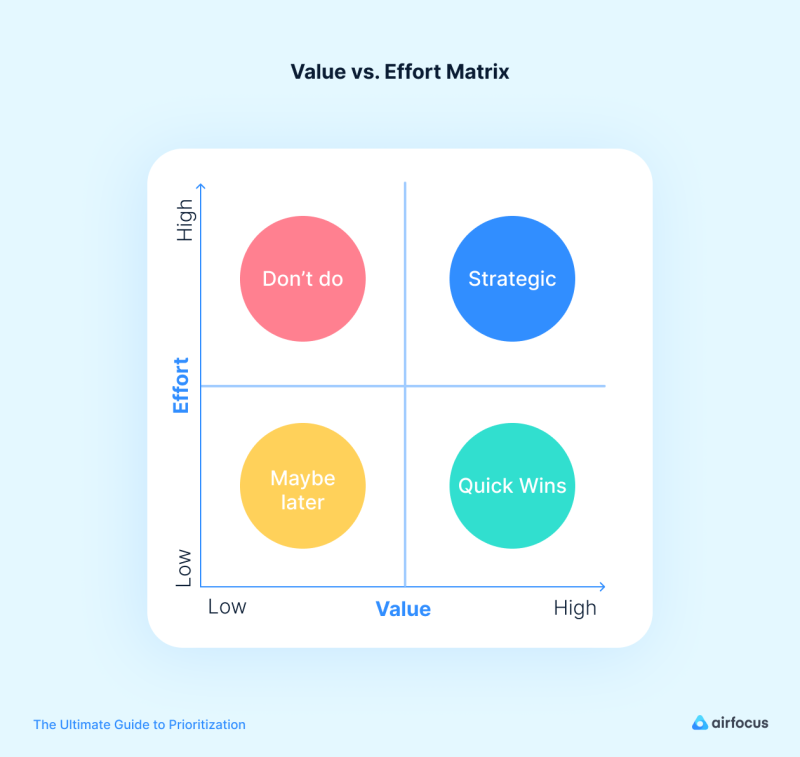
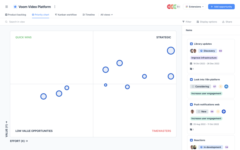
Value vs. Effort allows teams to assess their initiatives based on how much value they will bring and how difficult they’ll be to implement. This method has the advantage of visualization as the team will plot their items in a quadrant to decide how to distribute and prioritize initiatives.
In order to be more objective, the placement of the items could be defined quantitatively by a decision matrix (see weighted scoring).
Your team creates a prioritization matrix with Business Value as the Y-axis, and Effort as the X-axis. You then break the matrix down into four quadrants, as shown in the example below: high value & low effort; high value & high effort; low value & low effort; low value & high effort. From this starting point, your team will be able to plot each initiative in the relevant quadrant.
Please note:
The Value Vs. Effort model is sometimes called a “prioritization matrix”, which is another term for decision matrix. Don’t get confused.
In practice
Items in the high value & low effort will be deemed top-priority as these are considered quick wins. On the other end of the spectrum, there are the low value & high effort items, which are likely items to cut as they are difficult to implement and promise low business value.
When and why should you use the Value vs. Effort framework?
Due to its flexibility, intuitive implementation, and objective approach, it can be applied to numerous prioritization cases. This is particularly useful when you are timeboxed or have very limited resources, as well as when your team is developing a new product, or if you’d simply like to remove bias and have a more objective approach to initiatives that your team might feel strongly about.
Oftentimes we reject an initiative and assume it’s not worth it because of the effort it entails, or quite the opposite when our team is very keen, but upon shedding some light on its business value by plotting them in the quadrant we might reconsider.
How does the Value vs. Effort framework work?
Assess the overall value and effort for your features
In order to place your items on the chart, you first need to assess each item you want to prioritize against the following questions:
How much value will the item bring? Both on a business level, and directly to the user.
How much effort is required to build it?
Let’s delve into the subcategories:
Value
While considering value, we must ask ourselves: what does value mean for our business? And what does it mean to our user personas?
Business value:
This requires you to estimate how much value particular initiatives can yield for the company. This value can be determined by factors such as whether an initiative will generate new revenue, increase customer lifetime value, acquire new users, retain existing ones or reduce churn, among others. Another thing to consider is the impact on brand awareness.
User value:
This describes the value each initiative will bring to your user. You should consider their pain points and how far it goes to reduce them. Is the market demanding this feature? Will it improve your users’ efficiency (or other similar metric)? Will it benefit a large number of users or only a small group?
Effort
How do you measure the effort required? This question can only really be answered on a case by case basis. For most product teams this could be as simple as estimating the total amount of developer hours a certain initiative will require. However, oftentimes it involves a combination of other categories, including risk, among others...
Some of the most common considerations to score effort are:
Developer hours
Overall resource hours needed (man days, persons per month)
Overall operational costs
Risks (risk of failure, unanticipated perceived value upon delivery)
Costs (internal or buying external goods and services)
Story points
Which sub categories you use is up to each team to determine, depending on their resources and priorities.
Determining your priorities with the matrix
Now that you’ve plotted your initiatives on the different quadrants of the matrix, it is time to decide which to include in your roadmap, and in what order.
This is how each quadrant will help you prioritize them:

Tip:
Instead of placing your items on the quadrants manually, you can back your ratings with weighted scoring to make more objective decisions. Then place them on your “map” This allows you to have a specific weight for each subcategory depending on what’s most important to your business right now. By using a dedicated prioritization tool, this can be done with just a few clicks.
Why we love it
Extremely flexible and intuitive:
applicable across any type of product, organization, and industry due to value and effort criteria taking on a range of metrics.
Can be done qualitatively or quantitatively
**Resource allocation:**enables you to focus on items that will have the largest impact based on their goals and effort.
Objective perspective:
having inputs from different stakeholders or team members allows us to standardize how we prioritize different initiatives.
Aligns stakeholders:
reaching a common ground on how to prioritize our initiatives allows for stakeholder buy-in.
A few downsides...
Could be subject to systematic error:
usually this is introduced by those estimating how much value or effort each initiative represents. This may result in results being skewed too high or too low.
Best for small teams:
it's hard to implement for teams with large pipelines as well as large teams.
RICE Scoring
What is RICE scoring?
The RICE scoring model was introduced by Intercom a few years ago and has been widely adopted and used by product managers and product owners to prioritize feature releases and projects. This framework is structured into four key criteria that form the acronym “RICE”. The RICE prioritization framework helps avoid bias towards features and projects you personally prefer.
The acronym consists of four criteria (reach, impact, confidence, effort):
Why and when should you use RICE scoring?
The RICE scoring model is one of the best frameworks if your product team is trying to work out in which order they should prioritize initiatives or features. It is a time-saving and consistent framework, and its objective scoring can be a great help when a product team is trying to derive the importance of an initiative. When used correctly, it allows the team to evaluate which features are crucial and which are not.
How does RICE work? A formula for success
A RICE score is calculated by dividing overall value by how much effort is needed to get there. This formula provides a standardized score, which allows us to objectively decide which items to prioritize. We will break down each of the factors to get a good understanding of their importance and how they work.
Reach
Reach represents the number of users or paying customers that would be directly affected by this feature during a set time period.
This could be customers per month, and in the case of events, they could be transactions per month or actions.
That can mean things like the number of people that would interact with a certain feature in a month or a reduction in churn over a month following the release of a new feature.
Examples:
New onboarding: This feature will reach an estimated 3000 new users per month
Google Calendar integration: This feature needs to be activated right after onboarding. Therefore if 3000 users finish the onboarding and 80% choose to turn it on: 3000x0.8 =2400 users per month.
Slack bot: Every user who uses this feature every month will experience the upgrade. The reach is 1,000 customers per quarter.
Impact
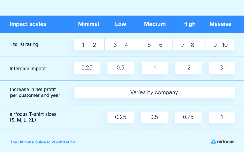
Impact is defined by the overall contribution of a certain feature to your product, reflected by the benefit your users will get from the said feature. Depending on your use case, it can also mean how much a feature will increase your conversion rate. Measuring how much benefit your users get from said feature can be hard, so there are several scales to choose from, with Intercom’s being a widely adopted standard.
There are numerous ways of determining impact. Some key questions to consider are: will this feature greatly improve our conversion rates? Will it help retain users? Does it improve the ease of use significantly? Perhaps it’ll make users have a eureka moment and realize this is exactly what they need.
The impact scale involves estimation, but this is much better than gut feeling. Here’s an example with airfocus T-shirt sizes:
New onboarding: it will have a large impact conversion rate therefore the impact score is 1(XL).
Slack bot: It will have a rather low impact on users, so, the impact score is 0.25 (S).
Google calendar integration: in terms of impact, it is somewhere in-between. The impact score is 0.5 (M).

Confidence
This metric accounts for the confidence you have in the estimations you made. Sometimes you believe a project could have a large impact but simply lack the data to back your assumptions up. In other words, how confident are you about your reach and impact scores? How much data do you have to back your scores up?
We use a percentage scale for confidence. Always ask yourself: how extensively can my data support my estimates? Typically 100% will represent “high confidence”, Medium equals 80%, and Low is 50% because anything below that would be a shot in the dark.
Let’s look at our example:
New onboarding
: We have heavily researched users for impact, conducting live-tests, and have exact numbers for reach, with an effort estimate from the team. This feature gets a 90% confidence score.
Google calendar integration
: I have data to back the reach and effort, but I’m still sceptical about the impact. This project gets an 70% confidence score.
Slack bot
: The reach and impact may be rather ambiguous, and the effort may be our most accurate criterion. This project gets a 50% confidence score.
Effort
This represents the amount of work that is required from your team to build a feature or finish a project. Depending on the use case, the value type could be person-months or project-hours.
Keep in mind that we make our estimates in whole numbers and that effort is a negative factor, being the denominator in the formula.
You can determine effort quite simply by asking: how much time will a feature require from all of our team members?
Here’s a person-month example:
Slack bot
: It’s a simple project requiring only a few days of planning, two weeks of design and few days of coding. We’ll give it a score of 2 person-month.
Google calendar integration
: It’ll take a week of planning, 3-4 weeks dev team time, and 1-2 weeks of design. We’ll assign it a score of 5 person-month.
New onboarding
: Planning this project will take several weeks, with at least 1 month of engineering, plus extensive design time. Therefore, the effort score will be 6 person-month.
Calculating RICE score
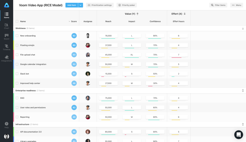
Implementing a RICE score should be easy to calculate with your team. Once you’ve determined your scores, you can plug them into a formula to get a final score, and compare your projects.

What do you do with the score?
So, you’ve got your scores and now you know which initiatives to prioritize first based on those that scored the highest. This will help you back your decisions with information and data and defend these decisions to other stakeholders.
Don’t forget:
There are externalities or criteria that RICE fails to consider that might influence what you work on first, such as dependencies, available resources of key-personnel, or perhaps you simply feel like working on a project first due to other externalities. But RICE will allow you to see the trade-offs of making such decisions.
Your RICE scores are best visualized on a Value vs. Effort chart. It will provide a quick overview of your best projects, low-value items you should cut, quick wins, and valuable but time-consuming projects so that you can assess them against each other.
Why we love it
Bang for your buck perspective: it allows teams to determine how much their effort is worth relative to their overall value. Which is exactly what we would like to maximize.
Paints a big comprehensive picture: criteria is based on factors that have the biggest impact on the product and user through alignment of vision and initiatives.
Compatible visualization: as it can be plotted on a value vs effort chart for quick visualization and decision making.
Reduced impact of bias: due to quantification and confidence on how much data backs our factors.
Based mostly on metrics: as the product progresses through its lifecycle we can continue making further improvements.
A Few Downsides...
Lack of accuracy: sometimes evaluating the reach or future impact of a project can be difficult.
Dependencies are not taken into account: this fails to consider that a low scored product could take precedence over a high priority one.
Blind to criteria that are not considered.
Kano Model
What is the Kano model?
The Kano model is a framework used to prioritize features on the roadmap based on how likely they will satisfy or delight users. Your team should pull together a list of features to be considered, and plot them on a chart that visualizes satisfaction versus functionality. It points towards how desired or needed a feature can be, or if users are simply indifferent to it.
When and why should I use the Kano Model?
Whenever your team is considering the list of features to work on for your next release, and would like to figure out what mix is the best. This will also result in the best allocation of limited resources and time.
Kano allows you to work out the right combination of:
Minimum basic features that must be included
Performance features to start working or investing in
Which delight features will impress users the most
How does it work?
Here’s where things get interesting; to identify how satisfied or even delighted users will be with a product, we have to consider the two dimensions (or plotted axes), satisfaction versus functionality. How will users react to the level of functionality of our features?
Let’s break it down:
Satisfaction (Y-axis) :
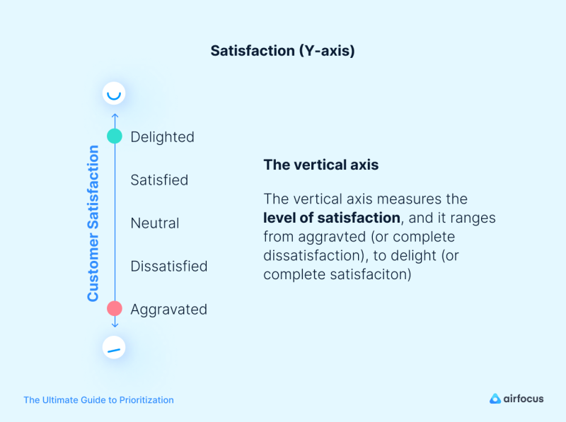
The vertical axis measures the level of satisfaction, and it ranges from frustration (or complete dissatisfaction), to delight (or complete satisfaction).
Please note: This doesn’t always work as a linear scale, as you’ll come to learn in the following section, and it’s impossible to always stay at the top of the scale.
Implementation (X-axis):
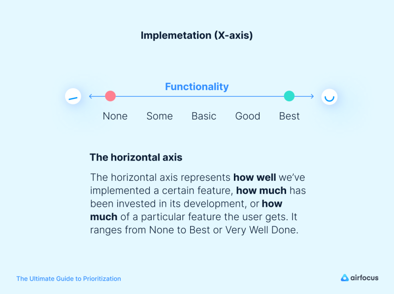
Also called investment or sophistication by some, this represents how well we’ve implemented a certain feature, how much has been invested in its development, or how much of a particular feature the user gets. It ranges from None to Best (or Very Well Done)
The four “feature buckets”:
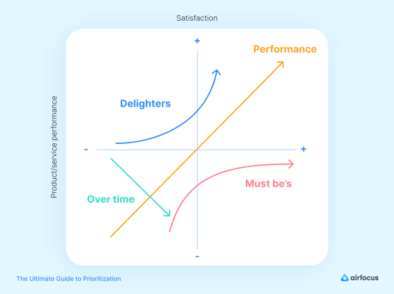
Looking at the graph we can quickly identify and classify the features into four different buckets:
Basic Features: also known as must-be features. These are expected by your users but they won’t satisfy them more. Without them, they won’t even consider your product. For example, we expect our email to be able to import or look up contacts, or a messenger app to send messages. If they don’t have this or the feature doesn’t work, users will simply go elsewhere.
We expect these features to be there and work, and therefore we see that as our product team puts more effort or money into making them more functional, our satisfaction grows. Yet it will never reach the positive quadrant.
Once it reaches its maximum potential, the team can stop investing effort into it.
Performance features (one-dimensional): The more of these we give users, the more satisfied they’ll be, therefore moving in a linear direction. As we increase functionality, so does our investment. Examples could be storage space on your cloud service or faster internet from your provider.
Attractive features: also known as delighters. These are pleasant surprises that the user isn’t expecting, but as the name suggests, once introduced they immediately generate excitement. Introducing these features can be what differentiates you. Think about the time Apple introduced Apple Pay from your iPhone, or the first time you were able to collaborate on Google Docs.
These are the kind of features that make you go, “Wow! How cool!”, and if plotted on the graph, it’s easy to see how the slightest increase of functionality will rapidly increase satisfaction.
Indifferent:
Certain features simply don’t make much of a difference. The user feels indifferent towards their presence or absence, and they, therefore, don’t have an impact on the interaction or reaction. In other words, you should avoid working on these.
Features categories change
Categories change over time in a dynamic environment, just like user expectations. Our users will change their perception of product attributes in the future. What now seems to be a game-changer to you, might become a standard or expected a year from now. That’s why Attractive features will eventually transform into Performance and Basic features in time.
What our customers feel about some product attribute now is not what they’ll feel in the future. Attractive features turn into Performance and Must-be features as time goes by.
The questionnaire
In order to discover customer insights about your product’s features, we must deploy a Kano questionnaire followed by an evaluation of the different combinations.
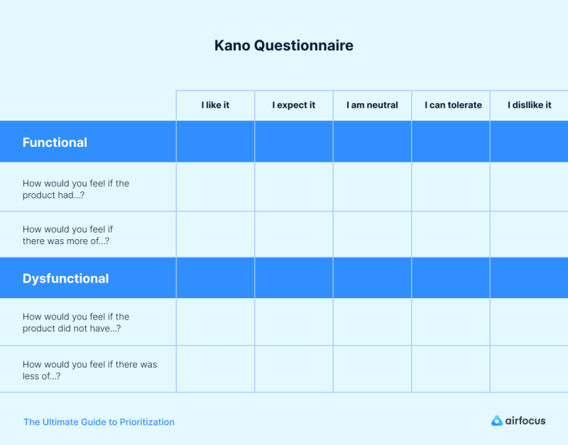
The questionnaire consists of questions about the feature we’d like to assess, and the questions are termed functional or dysfunctional forms:
If you have this feature, how do you feel?
If you don’t have the feature, how do you feel?
The possible answers for these questions are:
I like it
I expect it
I am neutral
I can tolerate it
I dislike
The steps
The Kano model is undoubtedly one of the best models to highlight market fit, being customer-centric allowing immediate identification of product advantages and weaknesses through its features.
In order to discover customer insights about your product’s features, we must deploy a Kano questionnaire followed by an evaluation table of the different combinations, that we will then plot on the graph.
Consider this:
In practice, you should also consider adding an extra question, asking how important they consider a certain feature to be.
This answer allows you to distinguish which features are most important to users. It’s a tool to differentiate big from small features and the impact they have on your user’s view on the product.
Evaluate and plot
The beauty of the Kano model is that when we pair up our functional and dysfunctional answers, we uncover how much a feature is wanted, needed or if our users are indifferent to it.
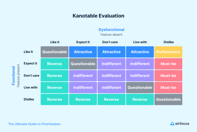
We use an evaluation table to uncover in which categories our features fit, by pairing functional answers with dysfunctional ones in rows and columns.
Before we proceed: You’ll notice that there are two new categories in the table - Questionable and Reverse.
Questionable suggests that someone didn’t quite understand the questions or feature being described.
Reverse suggests that what we suggest is the opposite of what the user wants.
What to do with our results?
First, you need to fully understand the table and what each pairing means in terms of categories.
Questionable: they are contradictory so you’ll always see them in a diagonal pattern across the table.
Performance features: these are features that users like having and dislike not having. The more performance features, the better.
Must-be (basic): Users dislike not having them, and when present they range from tolerating to expecting them.
Attractive: Users like having features they don’t expect to have. The dysfunctional range will therefore go from ‘expect it’, to ‘tolerate it’.
Indifferent features: Will always be in the middle of the table (as in the graph), as users are always neutral or can tolerate them, in both their functional and dysfunctional answers.
The final step
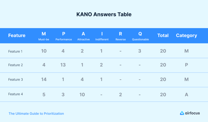
Now you know how each pairing is categorized you’ll want to get all your answers together and organize your data to see where the features go. The two approaches to organizing your data are called discrete and continuous analysis.
If you are new to this and don’t have much time, we recommend using the simpler approach- discrete.
The discrete approach gathers all of your respondents’ answers from the evaluation table. You should then count the total responses per category or demographic, and designate a feature’s category based on the most recurrent response. This will allow you to also place them on the quadrant.
In order to prioritize your results, use the following order:
Must-be
Performance
Attractive
Indifferent
You’ll end up with a table like this:
Why we love it
It highlights market fit:
fully customer-centric, it allows immediate identification of product advantages and weaknesses through its features.
It tailors a product to the needs of current and target users.
This allows for predictions about features and audiences based on expectations.
A few downsides...
Subject to inherent limitations caused by survey delivery
It solely focuses on customer opinion:
this means it ****fails to account for a level of knowledge about the product and individual bias.
Prone to delayed time-to-market :
delays are due to surveying, data collection and processing time.
Story Mapping
What is story mapping?
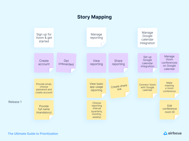
Story mapping is a widely used method of ordering user stories along different dimensions to provide a big picture of how they fit within the overall user experience.
This map arranges the essential steps of the customer journey on the horizontal axis in chronological order, guided by how the user would perform said tasks in their interaction with the product.
The vertical axis describes criticality or necessity, and different user stories are therefore arranged vertically, top to bottom, based on importance. This highlights the importance of differentiating importance in order to generate strategic release plans.
The beauty of doing this is that after you’ve completed your story map, you’ll be able to visualize all the possible ways in which your users could interact with your product.
This allows you to map the flow of their behavior as they progress from their first interaction through to their last step of their objective with your product.
Why should I use it?
This type of backlog organization has quite a few advantages when it comes to prioritization and execution of your product. Firstly, it is a visual tool that really allows stakeholders, your development team, and clients, to get a full picture of how users are interacting with the product. This creates common ground for those who often get caught up in their own details. It happens to the best of us! This big picture will help identify issues or gaps you might have previously overlooked.
Secondly, when it comes to prioritization, this framework provides teams with valuable insights as to how to release product iterations with increasing sophistication. By defining these, the team is empowered to complete and deliver end-to-end versions more quickly, allowing you to rapidly validate concepts.
Last but not least; you can apply it to any stage of your product life cycle.
MoSCoW Method
What is the MoSCoW method?
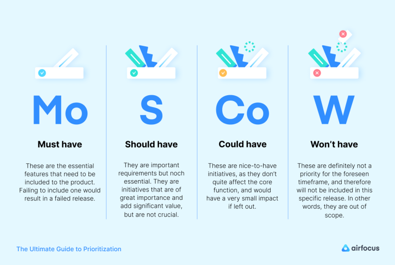
The MoSCoW method is one of the most popular prioritization techniques to establish what is most important to clients and stakeholders. By using this method, stakeholders can better understand the importance of different features in a release. It is extremely quick and simple to apply as a prioritization solution, classifying features in four different priority buckets: Must Have, Should Have, Could Have, and Won’t have
Let’s break them down:
Why and when should I use it?
The MoSCoW model sets your initiatives by order of priority, and can therefore be applied to any phase of the product life cycle. However, it is most applicable to product launches, market launches, particularly early stage products and MVPs.
This is a good method to get the whole organization involved in the prioritization process, which in turn creates a broader set of perspectives by getting different departments involved.
Effort is another reason why you’d want to apply this method. Using it will enable your team to quantify the amount of effort allocated to each feature or initiative, resulting in the right combination of features per release.
How does the MoSCoW method work?
In order to run the MoSCoW method smoothly, your product team and stakeholders need to decide on the objectives and factors that will be decisive to the criteria. This will be immediately followed by reaching a consensus on what initiatives or features you’d like to select.
Setting these ground rules is of extreme importance — in particular how to settle disagreements —as this can become serious bottlenecks down the line.
Lastly, define how much effort should be split between the Must-Haves, Should-Haves, and Could-Haves. This typically varies by team and project, but a rule of thumb suggests that you should dedicate about 20% of your total effort to Could-Haves.
Now your team is ready to sit down and discuss your initiatives. Let’s look into them:
Must-Have initiatives
The category name doesn’t come as a surprise as they will be the lifeblood of your product or release. These are non-negotiable features. Without them, your release could be a guaranteed failure. You should reach an agreement on how much time and effort you spend on your Must-Haves —you should focus on them, but shouldn’t allocate more than 60% of overall effort.
Ask your team:
Will this project work without this feature?
What happens if we release without it?
What’s the simplest way to accomplish this?
Should-Have initiatives
Being just under the Must-Haves in importance, they are still highly important to the product but not crucial. The product will still manage to function without them. On the other hand, you wouldn’t want to leave them out as they generate a significant amount of value.
To put it into perspective, you should include them in the release, but you could schedule them for a future release without having a negative effect on the current one.
Could-Have initiatives
These are nice-to-have initiatives, meaning that they are not necessary. They add to the product and generate value to the user, but they are not exactly a core component or function of your product. There would be no repercussions if you were to leave them out.
Won’t-Have initiatives
These initiatives are still important to take into account. You should always identify them as it’ll help the team decide what will not be included in the scope, thereby allowing them to prioritize other initiatives. They prevent you from wasting resources that your team needs for this release.
Lastly, the subgrouping of these is also beneficial. Perhaps there are Won’t-Have initiatives that will not be included within this scope, but could be included in the future, and others that simply won’t be included at all.
Why we love it
Gets business-side stakeholders involved in the feature prioritization process
Powerful and simple way to prioritize with timeboxes
Highly based on the expert opinion of the team, both technical and business side.
A few downsides...
Often prone to bias from managers worried that their initiatives will fall into “should” or “could”, which is exacerbated by bad KPIs.
Deciding where your initiatives will fall often becomes a never ending discussion when team members have different levels of familiarity with the product.
Priority Poker
What is Priority Poker?
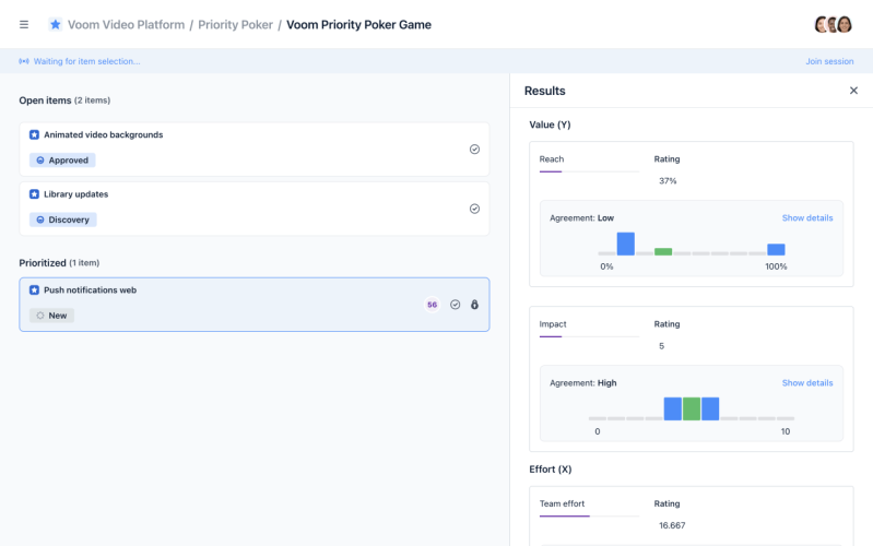
Priority Poker is an airfocus feature created to prioritize features and initiatives with a group of people in the most collaborative and time-efficient manner. It allows you to decide which new projects to start, or to estimate efforts among a number of criteria of your choosing.
Priority Poker can be done during a live-session or in your own time.
To make the best possible product decisions, product managers often need to incorporate stakeholders’ wisdom and expertise.
However, most of the time, teams and stakeholders have diverging opinions.
If you do eventually gather them into a meeting, you might risk having endless discussions without a constructive conclusion which means delaying development - the worst nightmare for all product managers and decision-makers.
Unlike traditional “democratic” methods of prioritizing items where we collaboratively discuss the rating of items one by one, each player rates items based on their own judgment, but just like a game of Poker, no one gets to see the ratings until it’s time to unveil them. Once the results are in, you can utilize the rating average or start a discussion when estimations differ tremendously.
Why should you use Priority Poker?
Priority Poker can be used in cross-functional teams and can be adapted to various projects. It guarantees alignment while getting selected stakeholders involved in the prioritization process. So if you are looking to save time, and collaborate in a way that includes everyone’s expertise when it comes to prioritizing items, this might be your go-to tool.
No matter how large your team might be, or how many remote stakeholders you have, it can be done completely remotely in a time-efficient manner.
Priority Poker is very flexible, you can change the different levels of priority and even define criteria based on the teammates’ expertise and involvement within the project.
Here’s a snapshot of what Priority Poker is perfect for: :
Anything product-related, such as prioritizing features, initiatives and backlog items.
Agile product management or scrum to execute sprint planning sessions and estimate efforts.
Any design-related task such as choosing personas, user journeys and scenarios.
Testing phases to prioritize bugs and fixes.
How does it work?
The owner can play the game in two ways:
Asynchronous: Players do the criteria ratings in their own time (for example, the owner invites players on Monday and asks them to complete the ratings by Friday).
Real-time: Players join a live game where the owner controls the flow by selecting one item to prioritize at a time (owner and players play item by item during a live prioritization meeting).
The game owner can invite an unlimited number of players. Said owner can invite and manage players and even set criteria permissions. Players can join the game on mobile or desktop.
Each player rates the items based on their own judgement, but no one gets to see the ratings (other than the owner) until it’s time to unveil.
Why we love it
It resolves the logistical hoops of prioritizing in large teams. It ensures prioritization in a productive and efficient manner, greatly reducing decision-making time while involving and aligning everyone.
It allows you to invite experts to your prioritization workflow, be they team members, customers or other external stakeholders to make the best possible decisions.
It enables you to give everyone a say which maximizes buy-in from your team.
It allows you to beat the HiPPO effect and tackles the issue of people influencing each other, with extroverts typically overshadowing introverts.
Remote teams are as much part of the conversation as in-house ones.
Learn more about Priority poker here.
Common prioritization mistakes and how to avoid them
1. Loudest or highest-paid person gut feeling dictating priorities:
The HiPPO (highest paid person’s opinion) effect - along with that of the loudest person in the room - threatens this process.
We tend to default to decisions to please our seniors, but we’re causing more harm than good. How do we say no to this overpowering voice?
Surely their experience could help, but keep in mind that personal bias always underlies opinions.
Studies even suggest a correlation between successful projects and junior managers who are more prone to welcoming employee opinions, and having their assumptions challenged.
Jeff Bezos once said: “Customer feedback flattens corporate hierarchies”. Your superior may not agree with your opinion.
But he or she will have a hard time arguing against your priorities when they come from a systematic scoring of customer feedback and market intelligence.
2. Lack of external (customer) inputs
Your team might have rounded up some great features for this release, but if they lack customer validation, how will you know they’re desirable?
Always validate your internal assumptions with customer feedback and/or other feedback sources and incorporate it into your decision process.
3. Losing the overview of dependencies
Prioritizing an item to complete it early only works when all preceding cross-team deliverables have been delivered on time.
You might be working on the next big item, but if other departments fail to deliver their preliminary work on time, your ambitious launch date will be delayed. As your product grows, so will your dependencies, and keeping track is a crucial part of it.
Modern product management tools can help you out and make it easy to keep track of your dependencies in a visual way. Visualize all your dependencies and make them a critical player in your prioritization process.
4. Striving to be a me-too product.
You can source valuable intelligence from your competitors, but your product should seek to have a unique selling proposition and prove its value.
This is only achieved based on solid research and getting to know your clients and coming up with innovative ideas. Always strive to set the pace.
5. Don’t build based on the highest bidder.
You might be tempted to prioritize features based on a high paying client. But keep in mind that these should fit your overall business and user goals.
You can download the complete guide with an in-depth explanation of how to use them as well as their major benefits, drawbacks and major prioritization mistakes to look out for.
CHAPTER 5
Roadmaps: The (Visual) Result of Your Prioritization Process
The results of your prioritization process, which is a decision of what to build and when are best visualized as a roadmap.
Your roadmap is the single source of truth to map out and visualize both the short and long-term direction of your product, as well as all the steps needed to deliver against your goals.
Being both a strategic and action-based document, it’ll be one of the most important tools in your product manager toolkit. We won’t delve into roadmapping in this guide, as it is a whole new topic. You’ll find numerous useful and actionable resources about roadmapping within our learning material and tools. That’s why we’ve structured a collection of all the essential roadmapping bits you should know in order to build a great roadmap.
Typical information you should find on the roadmap
Roadmaps only include the most necessary information. This includes milestones, responsible teams or people, items, initiatives, themes, and of course, progress.
Level of detail varies by audience
You'll have to adapt the level of detail depending on the audience you are sharing your roadmap with. Executives and C-level will need a zoomed-out version, as they don't need as many details as your developers. Likewise, you would include less detailed timings and descriptions when presenting a public roadmap (versus an internal product roadmap).
Depending on your use case or audience you may decide to opt for a:
Progress-based roadmap: A progress-based product roadmap divides the current items into lanes based on the level of progress, for example as "to-do"/"in progress"/"done" or "Now"/"Next"/"Later
They are commonly used in agile development, one of the reasons being that they generally offer users more flexibility than a time-based roadmap as, instead of being restricted by dates and deadlines, tasks are based on progress or outcomes.
Time-based roadmap: These types of roadmaps are primarily focused on dates, milestones and deadlines. They use time as the main mechanism for measuring success, which can be a great method for visualizing how your product will progress over time. These are best used as delivery plans, rather than strategic roadmaps.
There are hundreds of roadmap templates out there, and they can also include both progress and time based combinations.
But the bottom line is that when done right, it will be the tool that ensures that you are focusing on the right things at the right time.
What tool to use for creating a roadmap?
A lot of people are still spending hours(!) transforming their JIRA projects into a product roadmap using Excel or Powerpoint. The thing is: your roadmap will change regularly and you need to be able to adapt it in minutes.
This document is meant to help you keep everyone aligned, being your single source of truth. Your product roadmap should always look visually slick so that it makes a good impression when presenting it to colleagues and management.
But it shouldn’t require you to be a gifted designer to create a visually appealing roadmap.
The right tools, like airfocus for example, will take care of that allowing you to concentrate on the content instead.
Moreover, your audience should always have access to an up-to-date version (e.g. via a link) instead of searching for an outdated Excel file in their Email-Inbox.
how airfocus can support your team.
Book a demo
Too busy?
Download now & read later.
Get the PDF